This website seeks to make it easy for you to understand how different countries are performing on well-being related indicators. The information visualized is taken from the 2011 United Nations Human Development Report. For academic purposes, its content has been curated and consolidated into 15 indicators organized by categories such as Education, Economy, Health, Environment, Gender, and People’s life satisfaction.
how do i figure out how my country is doing
It’s very simple: the higher the score on each indicator, the larger the colored triangle. On the top half of the circular diagram you will find triangular indicators that represent positive achievements in human development, i.e. Life expectancy at birth, Female participation in the labor force, Renewable energy and others. The bottom half of the circular diagram shows triangular indicators that can be regarded as negative and do not contribute to enhancing people’s well-being. Therefore, the visual scenario for a country with a high-level performance ranking for human development will be something like the figure as follow.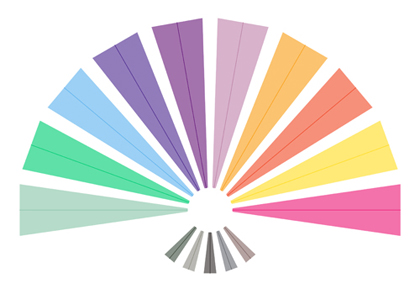
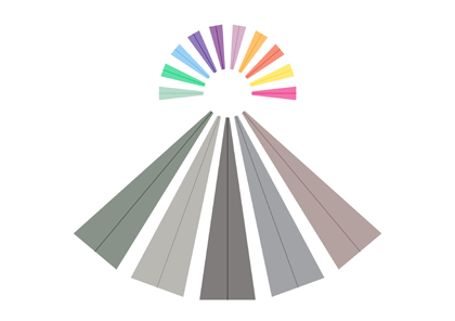
The visual scenario for a country with a low-level performance will be something the figure below.
We hope this website inspires you to explore the nuances between high and low performance and to think about which indicators are important to you when it comes to defining your well-being.